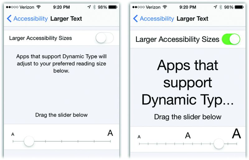
How to use central control panel for iOS’s Dynamic Type feature

In September 2015 with the release of 6S iPhone, users are looking to the next generation of iPhone, the attention of iPhone 7 is also a straight rise.
From the home screen a variety of app to the system is the basis and IOS 9 for you bring layers of surface optimization.Siri more intelligent than ever, it offered the function allows you to use more conveniently; slide over and split view and pip function, then let the iPad on the multi task processing reached a new height. All of these improve, not only can let your equipment all can, help you every day more achievements.
When Apple introduced the sparse, clean iOS 7 design that lives on in iOS 9, thousands blogged out in dismay. “It’s too lightweight! The fonts are too spindly! The background is too bright! There aren’t rectangles around buttons—we don’t know what’s a button and what’s not! The Control Center is transparent—we can’t read it! You moved our cheese—we hate this!”
Well, Apple may not agree with you about the super-lightweight design. But at least it has given you the options to “fix” it. You can make the type bigger and bolder, the colors heavier, the background dimmer. You can restore outlines around buttons. And so much more.
Larger Text
This option is the central control panel for iOS’s Dynamic Type feature. It’s a game-changer if you, a person with several decades of life experience, often find type on the screen too small.
Using the slider, you can choose a larger type size for all text the iPhone displays in apps like Mail, iBooks, Messages, and so on. This slider doesn’t affect all the world’s other apps—until their software companies update them to make them Dynamic Type–compatible. That day, when it comes, will be glorious; one slider to scale them all!
TIP: The switch at the top, Larger Accessibility Sizes, unlocks an even longer slider. That is, it makes it possible for you to make the text in all the Dynamic Type–compatible apps even larger.
Bold Text
In iOS 9, the system font is fairly light. Its strokes are very thin; in some sizes and lighting conditions, it can even be hard to read.
But if you turn on Bold Text (and then tap Continue in the confirmation box), your iPhone restarts—and when it comes to, the fonts everywhere are slightly heavier: at the Home screen, in email, everywhere. And much easier to read with low light or aging eyesight.
It’s one of the most useful features in iOS—and something almost nobody knows about.
Button Shapes
Among the criticisms of iOS’s design these days: You can’t tell what’s a button anymore! Everything is just words floating on the screen, without border rectangles to tell you what’s tappable!
That’s not quite true; any text in blue type is a tappable button. But never mind that; if you want shapes around your buttons, you shall have them—when you turn on this switch (below, right).
There are three switches in here. Reduce Transparency adds opacity to screens like the Control Center and the Notification Center. Their backgrounds are now solid, rather than slightly see-through, so that text on them is much easier to read. (You can see the before and after here.)
Darken Colors makes type in some spots a little darker and heavier. You notice it in the fonts for buttons, in the Calendar, and in Safari, for example. Finally, Reduce White Point tones down the whiteness of iOS 8’s screens, making them slightly dimmer and less harsh.
Reduce Motion
What kind of killjoy would want to turn off the subtle “parallax motion” of the Home screen background behind your icons, or the zooming-in animation when you open an app?
In any case, you can if you want, thanks to this button.
The Settings app teems with little tappable on/off switches, including this one. When something is turned on, the background of the switch is green; when it’s off, the background is white.
But if you’re having trouble remembering that distinction, turn on this option. Now the background of each switch sprouts visible symbols to help you remember that green means On (you see a | marking) and white means Off.
Together, these options go a long way toward restoring readability to your iPhone or iPad.


